Mozart
project overview
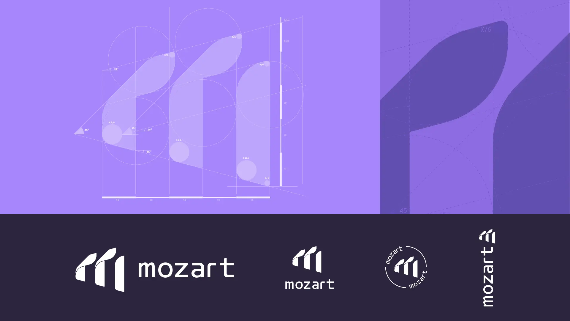
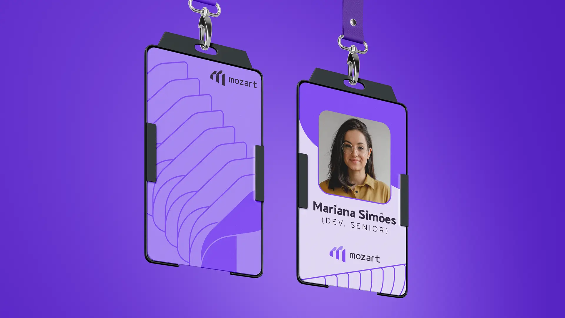
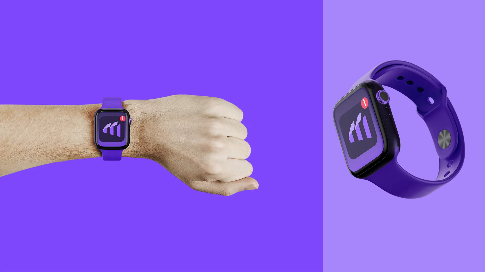
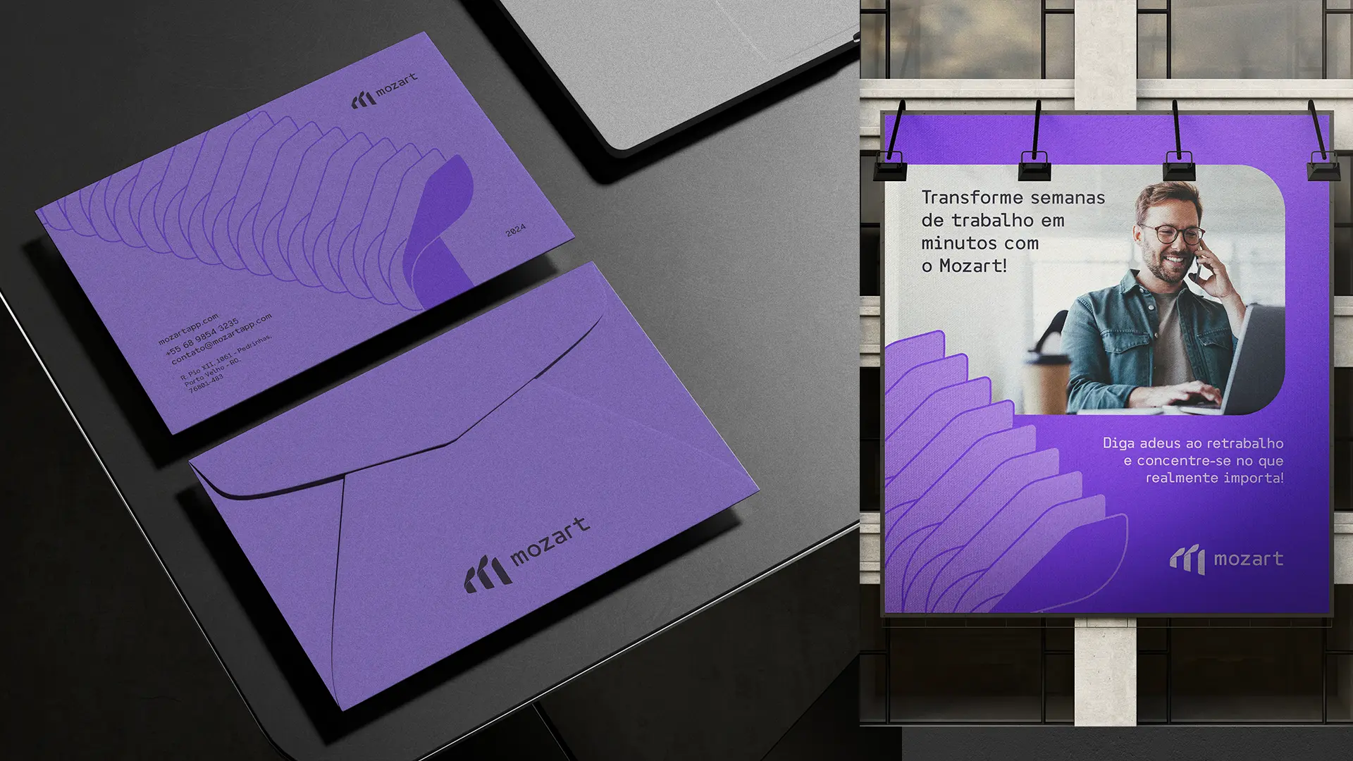
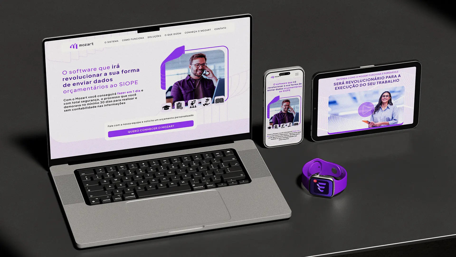
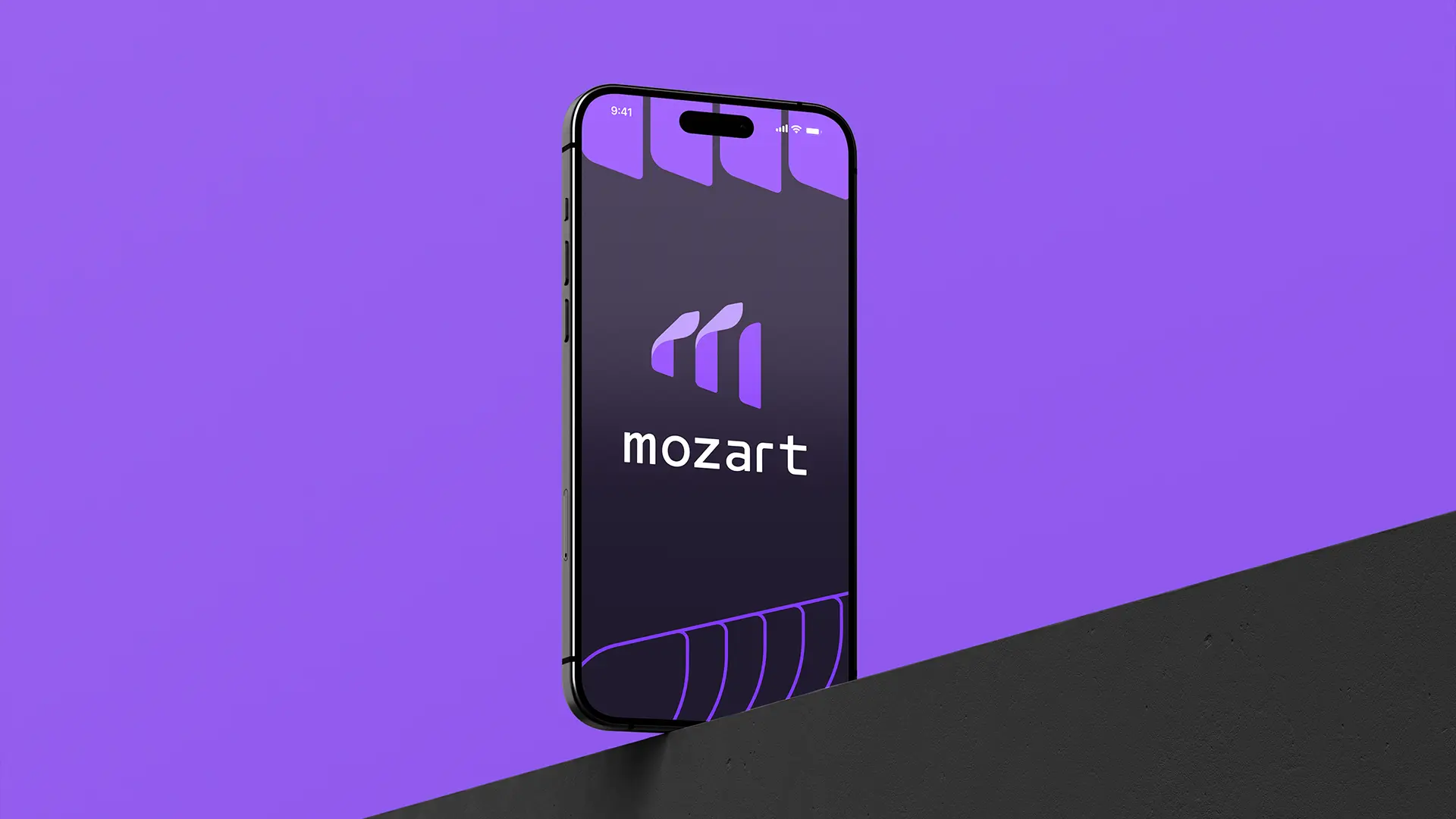
mozart needed a brand as fast and forward-moving as the product itself. we built a complete identity system around a symbol that reads at once as an "m", a set of ascending forms and a signal of momentum. the result is a flexible, geometric system that scales from app icon and splash to every brand touchpoint.
project type
Brand Identity and Website
year
2024
my role
brand identity & landing page
client
Kleyton Magalhães